Monday, 3 February 2014

The Great Interior Design Challenge

This month we've been watching The Great British Design Challenge, which is a twelve- part series that sets out to put Britain's keenest amateur interior designers to the test.


The BBC says, "Throughout the series, brave home-owners give over their bedrooms, kitchens, living rooms, dining rooms, hallways, and studies to put them all to the test. Each episode will follow the wannabe designers' trials and tribulations as they source materials, select products and try to find everything they need to make their room look great while staying in budget."


We love the way that the presenter, Tom Dyckhoff, architecture and design critic for The Times, fully informs the viewers on the design for each episode's chosen period from Georgian to Art Deco. It's a great example of the research we always recommend to our customers before a period look is to be attempted. 


The bit we're not so sure about is the claim that "the show will also be packed full of handy tips and guides for keen home decorators everywhere." By the time we'd seen a coat of gloss being applied directly onto an untreated surface, only hours before the final judging, without any comment from the presenters, we became somewhat sceptical.


Perhaps not the buzz-words of the moment and certainly not in-keeping with society's desire for fast-paced makeovers. However, to get a long-lasting, professional-looking finish, we always advise attention to preparation. 


The contestants are only given brief outlines from which to prepare mood boards and concepts for their given space. One way that some contestants stand apart from the rest is their ability to build a colour/decoration scheme in relation to the non-negotiables, whether that be pieces of furniture or the amount of natural light a room receives. 


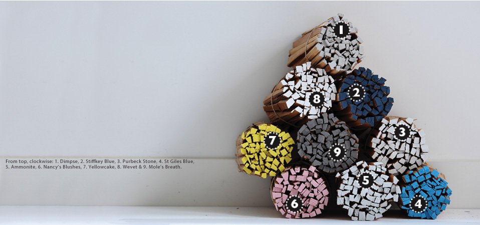
For instance, the winner of episode one, Sarah Moore, had clearly thought carefully about her scheme and based the colours around her fabrics, style in other rooms and interests to be reflected by the room. This is work that absolutely pays off, even though it takes time. We advocate collecting ideas well before you are ready to proceed with the decoration of your chosen room. This could include wallpaper and fabric samples, and images from Relics of Witney's Pinterest of rooms showing colour combinations and styles which appeal to you. Pasting all of these into scrapbooks or onto a large piece of card can help you find your style mojo.

Great Interior Design Challenge makeover

Our big bugbear with The Great Interior Design Challenge is that, whilst it may make great television, rushing a room's design is never a good idea. 
These are talented individuals. As a pertinent example, a 48-hour deadline created this room, which shows very little of contestant Sarah Moore's creative flair....


yet take a look at Sarah Moore's beautiful staircase in her home, created using vintage wallpaper....and a great deal of thinking time....


If you're tempted to rush into decorating or are not entirely sure how to get to grips with a particular painting project, and need input fast, then call into Relics of Witney or contact us for a chat. We're chock-a-block full of useful information that we love sharing with our customers. 

Didn't your grandmother tell you? 
A quick trip to Relics will save work in the long run!


Images via: BBC, Sophie Robinson, Enchanted England, Relics of Witney, The Daily Mail, Sarah Moore, BBC, Sarah Moore, Sarah Moore

Enter your email address:

to subscribe to Relics of Witney

Wednesday, 1 January 2014

How To Use Colour More Effectively: Red

Let's welcome in the New Year with a new series of colour studies. We're often asked for tips on how to introduce particular colours into schemes so we hope you'll find it useful to hear our hints and tips to use when planning for projects in the coming months.


We're kicking off with RED
Loud, proud, warm and inviting. 
Red invites, welcomes and intoxicates. 
This is because red is what's called an advancing colour, meaning, in essence, that it appears to move towards you. 


The image below of our range of Sanderson paints shows what we mean in a visual context:


Most of the shades fade into a pleasingly harmonious background, while the varying shades of red seem to lunge forwards.

Farrow and Ball Ringwold wallpaper

The outworking of this is twofold. On one hand, a space painted red can appear smaller, yet on the other, it can create a feeling of cosiness; for example the bath, below, painted in Little Greene's Atomic Red, adds personality and spark in the otherwise neutral bathroom.


Red is a shade to be embraced but only with this knowledge.


From Farrow and Ball's Brinjal, a deep aubergine, to Little Greene's Firefly, an intense pillar box scarlet, there's a red for every taste, which is just as well because it's the perfect shade to brighten up an otherwise dull space. 


And front doors? If your home is feeling a little unloved, a little cold, then try painting your front door in a shade such as Sanderson's Firecracker, or the rather more majestic Paint and Paper Library's Plum Brandy.


Just look at this dramatic transformation:


A glossy tomato red such as Farrow and Ball's Blazer will turn your entrance in a space to love. You'd hardly believe it was the same door! Yes, without red, the world would indeed be a duller place. 

Will 2014 be the year you embrace your inner red?! 


Images via: Little Greene, discover southwest, Sanderson, Farrow and Ball, Easy Living, Little Greene, Little Greene, London Doors,  Perlucida

Enter your email address:

to subscribe to Relics of Witney

Monday, 2 December 2013

The Perfect Christmas Craft: Gilded Bowls

Welcome to December's post. We're feeling thoroughly excited with our Christmas-inspired craft this month. By spending just a few pounds on some simple supplies, you can create an incredible centrepiece.


You will need:
Terracotta Pots


First of all, paint your terracotta pots. You only need a very small amount of paint for each so this is a perfect way of experimenting with different sample pots.


Take your time choosing these colours, as flashes of brightness give the gilding a slightly different appearance to softer neutrals.

Make sure you wiggle the paintbrush into all the gaps.


Step two is to apply your size, which is a type of glue that is designed to stay tacky, even when 'dry', a bit like the back of a Post-It note, only stickier. Using a brush, paint the size wherever you want your gilded finish.


Then comes the magical transformation! You need only wait until the size becomes transparent, which can take as little as fifteen minutes. Here it is half-way through the drying process:


Carefully take one sheet of transfer leaf at a time and press it on, gilded-side down, onto your pot.


Using your finger, or a paint brush, press evenly over the back of the paper. 


Firmly press the gilding paper into all the nooks and crannies. This will ensure that the leaf adheres to the painted surface. Carefully peel back and admire your handiwork!


Repeat this process everywhere that the size was applied. You may need to work over some areas several times to allow full coverage. Once the pot is covered to your satisfaction, rub your finger, or a clean paintbrush, gently but evenly, over the gilded surface to help detach any loose bits of leaf.


Gilded surfaces need sealing so we used Liberon's Fine Paste Wax in Clear to give a long-lasting finish..


Enjoy experimenting with different finishes for some truly stunning results. Relics of Witney sells Variegated leaf in different finishes, as well as brass, copper and gold. Contact us for more information.


On one of our pots, we applied variegated leaf solely to the inside surface, and on the other we created the reverse effect. It's worth paying extra attention to the edges for a more professional finish.


Merry Christmas from all of us here at Relics of Witney!

Enter your email address:

to subscribe to Relics of Witney

Friday, 1 November 2013

How To Use Little Greene's Grey Paint Collection

Little Greene have just released a whole new collection devoted entirely to greys. Grouped in four gradated families, each is based on one of four naturally occurring pigments: Verdigris, Umber, Ochre and Red Oxide.

LTCGrey7 28 Shades Of Grey

We've put together our own design boards to show you how well these paints can be paired with Little Greene's existing wallpaper range.


Let's start with Grosvenor Street from London Wallpapers III, in the Alchemy colourway, shown above with one of our gilded pots painted using Lamp Black.


Little Greene Grosvenor Street from London Wallpapers III, a stunning wallpaper featuring a dark charcoal background with metallic burnt silver, stone and white; this charcoal palette works well with modern furniture which leaves plenty of space for the wallpaper to take centre stage; try with Little Greene Loft White, Portland Stone and Lamp Black.


Little Greene Furrow, a deep taupe, partners well with Pines in Golde from Little Greene Oriental Papers (gilded pot in Furrow).


Clockwise from top: An elegant period front door in taupe with black details, take a look at our our beeswaxed door furniture for a similar period feel;  Little Greene sample pots; a warm grey palette of Little Greene Limestone, True Taupe and Furrow; Pines wallpaper in the Golde colourway; taupe is one of those colours that can move seamlessly from front door to hallway.


Pines wallpaper in Silver Pine partners beautifully with Little Greene Lamp Black and Scree.


Let's move onto the softer charms of the last column in the new Little Greene grey collection.


Clockwise from top: this is a soft look that suits a monochromatic touch; Perennial Grey is a feminine shade with warm undertones. Here we've teamed it with Little Greene's North End Road wallpaper from London Wallpapers III, in Warm Silver, North End Road wallpaper; we suggest using Little Greene Down, Dash Of Soot, Perennial Grey and Knightsbridge.


And finally, Wilton (in Halo) from London Wallpapers III, a gentle stone background with metallic champagne highlights, is teamed with Little Greene Limestone. But, wait....is that a touch of gilding you see?

Come back for December's post for step by step tutorial on how to create this stunning bowl....just in time for Christmas!

Enter your email address:

to subscribe to Relics of Witney

Tuesday, 1 October 2013

How To Make The Most OF Farrow and Ball's New Greys

Farrow and Ball have released nine new colours: five beautiful greys, and four brighter hues. This month, we've prepared mood boards to demonstrate how to make these greys work for you and your home.


The greys are, typically of Farrow and Ball, delightfully and quirkily named:

Mole's Breath
Purbeck Stone
Ammonite
Dimpse
Wevet


Clockwise from top: Farrow and Ball's Mole's Breath; a gorgeous dining room, showing how well this moody colour works with our grey rattan chairs (image via Momtoo); try Mole's Breath in an airy conservatory for a more contemporary look (via Roses and Rust); our timelessly classic grey rattan chairs; Farrow and Ball


Try Farrow and Ball Railings for the cupboard colour in the image above, and Farrow and Ball Ammonite for the walls (image via Pinterest). We love the way Farrow and Ball's new greys harmonise so expertly with their existing palette.


Clockwise from top: Farrow and Ball Purbeck Stone; pretty bedroom showing Farrow and Ball's Hardwick White on the cupboards and Cornforth White on the walls (via House To Home); our Rattan baskets, Farrow and Ball Railings, Farrow and Ball Purbeck Stone


Clockwise from top: Farrow and Ball Dimpse; Farrow and Ball Wevet; Farrow and Ball Dimpse; our beautiful cast iron lanterns complement these paler greys; find identical grey rattan chairs at Relics (via Decor Scoop)

And, as always, if you'd like more ideas for your home, or would like to find out extra information about anything listed above, then please don't hesitate to contact us.

Enter your email address:

to subscribe to Relics of Witney

LinkWithin