Monday, 2 June 2014

The Best Grey Paints

We're often asked our recommendations for the best grey paint colours. Our answer is always the same: where will you be using the paint? Is this a grey paint for use in a warm, sunny bedroom, or a cool, urban kitchen? Or do you want a grey front door? Or shed?

Grey sample pot
Grey sample pot

Grey paint, you see, is rarely simply a blend of black and white. In fact, any paint worth its salt will contain a gamut of subtle colour additions that make each grey absolutely unique; it's the complexity of these added hues that create the paint's undertones.
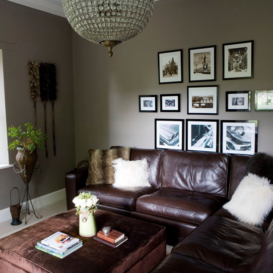
Grey living room
Grey living room

For paint advice that's absolutely suited to your needs, get in contact with the Relics team; we'd love to help you find that perfect grey paint. However, for the purposes of this post, we'll first recommend our current favourite grey front door paints, and then our favourite grey wall colours.

The Best Grey Front Door Paints

Farrow and Ball Railings is the colour to choose if you want a classic black door with a contemporary twist. Railings is a soft, dark grey with a hint of deepest blue in full sun.
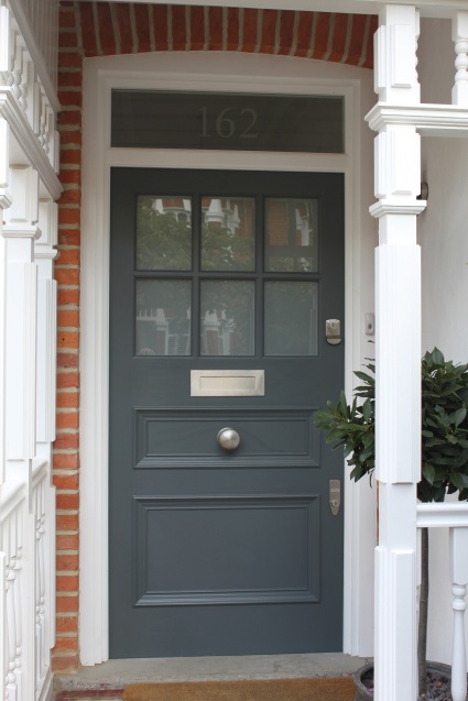
Front door in Farrow and Ball Railings


Front door in Farrow and Ball Railings

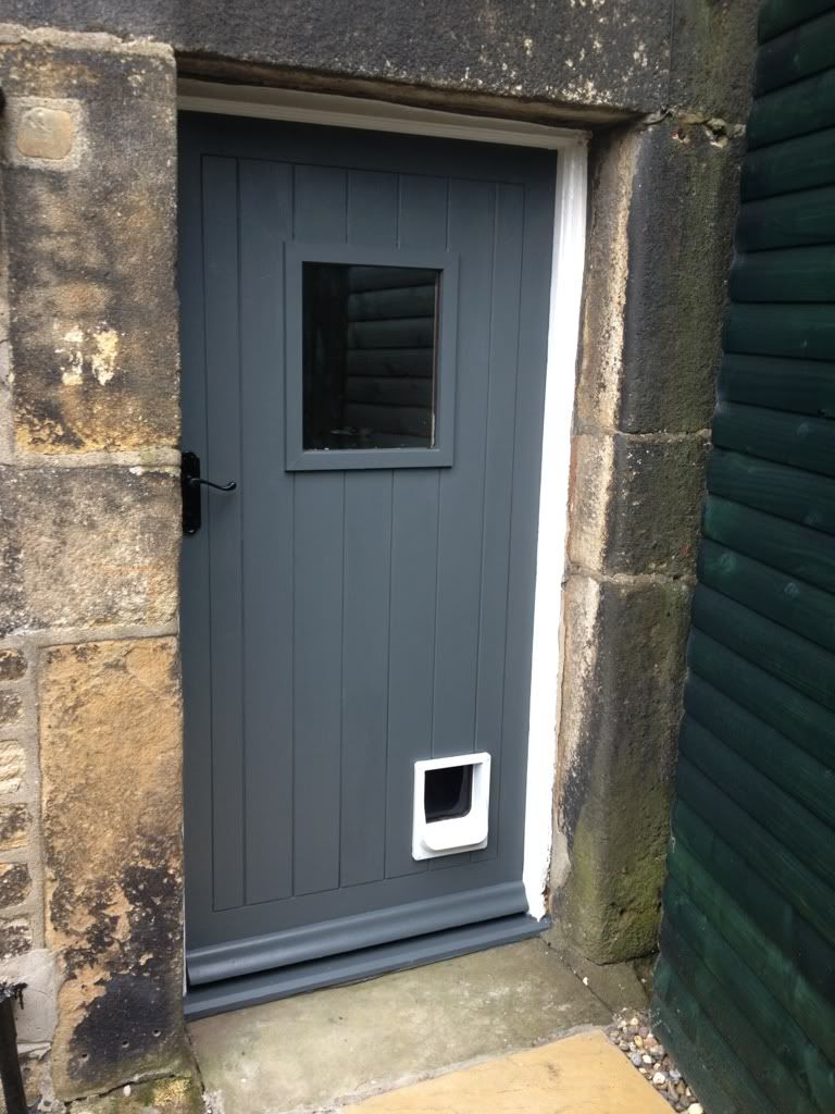
Farrow and Ball Down Pipe is a mid-dark grey with a hint of teal in warmer light. As the images below show so effectively, Down Pipe is a colour that springs to life as a front door paint whether placed against brick, stone or painted exteriors.
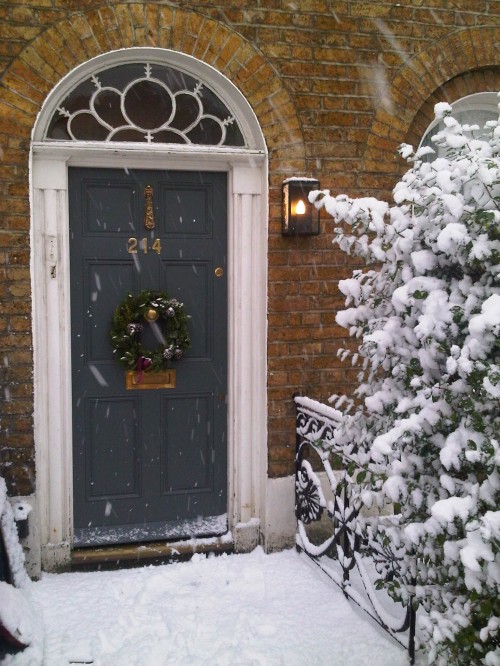
Front door in Farrow and Ball Down Pipe


Front door in Farrow and Ball Down Pipe


Front door in Farrow and Ball Down Pipe

Farrow and Ball Plummet, which is a paler version of Down Pipe, and fast gaining more and more popularity, has a coolly sophisticated charm of its own:

Farrow and Ball Plummett conservatory

Little Greene Scree is a true mid-grey. Bold and moody, it's a grey paint that looks great teamed with red brick houses:

Front Door Painted in Little Greene's 'Scree'


Victorian front door in little greene scree
Front Door Painted in Little Greene's 'Scree'

Here's a good illustration of how Little Greene Scree sits on the grey paint spectrum. Eggs painted in Little Greene Loft White, Shallows, Inox, Pink Slip, Urbane Grey, Teal, Scree and Lamp Black.

Egg Painted in Loft White, Shallows, Inox, Pink Slip, Urbane Grey, Grey Teal, Scree and Lamp Black!!
Eggs painted in Little Greene Loft White, Shallows, Inox, Pink Slip, Urbane Grey, Teal, Scree and Lamp Black.

Dulux Weathershield products are outstanding in quality, and have some beautifully subtle grey shades. Dulux Goosewing is a soft putty grey with gentle green undertones.

House front exterior in Dulux Goosewing paint

The Best Grey Paints For Interiors

For those of you who want a grey paint that appears truly grey, choose Manor House Gray from Farrow and Ball

Farrow & Ball's Manor House Gray


Paint color, Manor House gray by Farrow and Ball- # 265.
Farrow & Ball's Manor House Gray

Choose Farrow and Ball Lamp Room Gray for a grey that manages to appear quite warm, despite having a cool blue undertone.

painted in Farrow and Ball Lamp Room Gray.
Farrow and Ball Lamp Room Gray. 


painted in Farrow and Ball Lamp Room Gray.
Farrow and Ball Lamp Room Gray. 

For a gentler take on grey paint, try Farrow and Ball Cornforth White: neutral and soft, this is a grey that let's a rooms' bones speak for themselves. 

Farrow and Ball Cornforth White

Little Greene French Grey is an excellent choice for a grey painted kitchen that will stand the test of time. It's possible to juxtapose it with a whole host of other colours and French Grey will still look beautiful. Bold brights, soft neutrals, gleaming whites and darker greys all work with this classic stony grey.

Little Greene French Grey


Little Greene French Grey
Little Green Paint Company 'French Grey' and 'Dark Lead'.
Little Greene French Grey and Dark Lead

Dulux Dusted Moss is an excellent choice of grey paint if you want a limited palette to run throughout your house for harmonious continuity. It comes in four shades from a dark green-grey to the palest off-white.

Dulux Dusted Moss
Dulux Dusted Moss

And, for those of you who love a bit of colour, next month we'll be looking at our favourite emerald hues...


Images via: Wilko, Housetohome, voysey and jones, Lifebylotte, kate bishop, klaus and heidi, pistonheads, emma turner, just fab design, Little Greene, antony georgiou, Little Greene, Dulux, apartment therapy, nice kitchens, Claire Carlos, New kitchens, bryan turner, higham, Maple & Gray, harvey jones, Abigail Ahern
Enter your email address:

to subscribe to Relics of Witney

Thursday, 1 May 2014

How To Use Osmo Country Colours On Exterior Wood

We've talked in previous posts how much we love Osmo products....


Let's turn our attention now using Osmo products outside. Spring is the perfect time for prepping your garden to create a place that you find yourself wanting to spend time in throughout the (hopefully) long summer ahead.


Osmo Country Colour is an opaque satin-matt finish for interior and exterior woodwork. Osmo's products are based on natural vegetable oils, which makes them a fully eco-conscious choice. In fact, they comply with EURO Norm EN 71, which means that they would even be suitable for manufacturing children’s toys.


Osmo Country Colours are deeply pigmented, which will cover the colour and grain of the wood you are treating but still allow some texture to show through, maintaining the integrity of the wood and ensuring a rustic finish. 


They come in 18 colours, which can be blended together, or you can pick your own from any RAL or NCS colour tones to create your own custom mix.


Osmo products are thoroughly economical. They cover in only two coats, which act as a base coat and topcoat, with no need for primer. Osmo Country Colours are ideal to renew previously stained, weathered and discoloured wood surfaces, or to give fresh new timber a fantastic start with protection and beauty for many years


Microporous finishes allow wood to breathe, which reduces the risk of both swelling and shrinkage, which are common problems for wood that is intended for exterior use. The natural oils contained in the product penetrate deeply into the wood, rather than sitting on the surface, which keeps it elastic and healthy, preventing it from getting dry and brittle. Moisture can evaporate. Osmo Country Colours are extremely water-repellent, as well as UV-resistant and are designed to thoroughly resist mould, algae and fungal attacks.


Make sure that the surface to be covered is clean, dry and frost-free. Stir Osmo Country Colour well. Apply, with a stiff, good quality brush, evenly, very thinly and thoroughly along the wood grain. Allow 12 hours drying time. Then apply your second coat. 


Many wood preservers tend to become flaky after prolonged exposure to the elements, which brings us to one of Osmo's best features. It will not flake, peel, blister or crack. For maintenance, only one reapplication is needed but the wood will not need sanding.

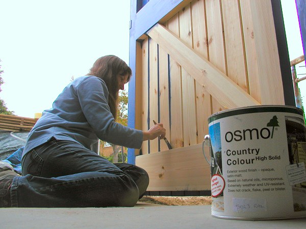
Pleasure Garden Bench using various finishes from the Country Colour range by Caroline L

Osmo recommend Country Colour for timber cladding, balconies, windows and sills, garden houses, garden furniture, pergolas, decking, screens, fences and shutters. 


If you have any questions, we're here to help...
All images via Osmo, except Living etc, Relics of Witney, The Telegraph, Osmo, Osmo, Osmo, Osmo, Osmo, Copthorne House, Osmo, Osmo

Enter your email address:

to subscribe to Relics of Witney

Saturday, 1 March 2014

The Best Exterior Green Paints For Your House And Garden

Spring is, well, springing into action before our very eyes. Buds are swelling. Birds are singing. And we know from experience that, at this time of year, customers everywhere are turning to their paint charts, searching for the best green paint to use on the exterior of their houses and in their gardens.

 
Let's take a look at some of the best greens out there for exterior use. The greens we find that are most consistently popular with our customers, for outdoor use, are those that harmonise with their surroundings for a gentle, and, indeed, genteel, feel. 

Our first three picks are some of our best-sellers by Dulux, whose Weathershield exterior paints are fantastically hard-wearing. To get a similar look to this beautiful orangery by Marston and Langinger, try Dulux Moorland.


You may notice that many of the greens we're recommending contain more than a touch of grey. When slightly greyed colours are used on front door in hot climates, they might look dull and drab but in England's, frankly, slightly grey-skied outdoors, greyed hues, if chosen carefully, take on a matchless serenity. 

For the stately effect of this taupe-green conservatory, try Dulux Lizard. 


Dulux Hopsack has a warmer, creamier feel.


For that hard-to-define Cotswold front door green, Farrow and Ball colours work extremely well. Who can resist the lure of French Gray?...but be careful if your site is too sunny, it can look somewhat washed out in the wrong conditions. Get it right, though, and Farrow and Ball French Gray has an unrivalled sophisticated warmth.


If you're looking for a refined mid-green then Farrow and Ball's Green Smoke works beautifully, shifting easily between green, grey and blue, depending on the orientation of the exterior.

Farrow and Ball, Decorating with Color, Jon Nicolson, Spitalfields, Green Smoke on door and shutters | Remodelista

For painting outside furniture, it's a good idea to choose slightly brighter colours, which will give a gentler effect once they are in situ, particularly if they are destined for a sunny spot in your garden. Farrow and Ball Cooking Apple Green works well for this.


And lastly, Little Greene does greens very well. Green is not always an easy colour to get right but we particularly love Normandy Grey, which is a subtle but warm grey-green....

1

And how's this for a rich, dark green? Little Greene's Obsidian Green keeps its depth wherever its painted which makes it an excellent choice for rooms which open out onto your garden.


Little Greene's Invisible Green has been designed with planting in mind to create a cohesive feel to your house and garden. It's the kind of colour that has a charm of its own, even if falls into disrepair.

Dark Green with Glass, Dontaylor

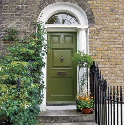
For a great heritage paint, our last choice is Little Greene's Light Bronze Green, which is based on a popular Victorian colour used to paint doors and railings in the 19th Century.


Have you been feeling overwhelmed by choice? It's a problem we're proud to help our customers overcome every day. Come into Relics of Witney and take advantage of our huge experience, to let us help you find your perfect exterior green paint colour. 


Images via Carolyn Rohme, Marston and Langinger, Marston and Langinger, Georgian Design, AbodeOrangeries, 
Farrow and Ball, Relics of Witney, Sims Hilditch, Litte GreenePinterest, This Old House


Enter your email address:

to subscribe to Relics of Witney

Monday, 3 February 2014

The Great Interior Design Challenge

This month we've been watching The Great British Design Challenge, which is a twelve- part series that sets out to put Britain's keenest amateur interior designers to the test.


The BBC says, "Throughout the series, brave home-owners give over their bedrooms, kitchens, living rooms, dining rooms, hallways, and studies to put them all to the test. Each episode will follow the wannabe designers' trials and tribulations as they source materials, select products and try to find everything they need to make their room look great while staying in budget."


We love the way that the presenter, Tom Dyckhoff, architecture and design critic for The Times, fully informs the viewers on the design for each episode's chosen period from Georgian to Art Deco. It's a great example of the research we always recommend to our customers before a period look is to be attempted. 


The bit we're not so sure about is the claim that "the show will also be packed full of handy tips and guides for keen home decorators everywhere." By the time we'd seen a coat of gloss being applied directly onto an untreated surface, only hours before the final judging, without any comment from the presenters, we became somewhat sceptical.


Perhaps not the buzz-words of the moment and certainly not in-keeping with society's desire for fast-paced makeovers. However, to get a long-lasting, professional-looking finish, we always advise attention to preparation. 


The contestants are only given brief outlines from which to prepare mood boards and concepts for their given space. One way that some contestants stand apart from the rest is their ability to build a colour/decoration scheme in relation to the non-negotiables, whether that be pieces of furniture or the amount of natural light a room receives. 


For instance, the winner of episode one, Sarah Moore, had clearly thought carefully about her scheme and based the colours around her fabrics, style in other rooms and interests to be reflected by the room. This is work that absolutely pays off, even though it takes time. We advocate collecting ideas well before you are ready to proceed with the decoration of your chosen room. This could include wallpaper and fabric samples, and images from Relics of Witney's Pinterest of rooms showing colour combinations and styles which appeal to you. Pasting all of these into scrapbooks or onto a large piece of card can help you find your style mojo.

Great Interior Design Challenge makeover

Our big bugbear with The Great Interior Design Challenge is that, whilst it may make great television, rushing a room's design is never a good idea. 
These are talented individuals. As a pertinent example, a 48-hour deadline created this room, which shows very little of contestant Sarah Moore's creative flair....


yet take a look at Sarah Moore's beautiful staircase in her home, created using vintage wallpaper....and a great deal of thinking time....


If you're tempted to rush into decorating or are not entirely sure how to get to grips with a particular painting project, and need input fast, then call into Relics of Witney or contact us for a chat. We're chock-a-block full of useful information that we love sharing with our customers. 

Didn't your grandmother tell you? 
A quick trip to Relics will save work in the long run!


Images via: BBC, Sophie Robinson, Enchanted England, Relics of Witney, The Daily Mail, Sarah Moore, BBC, Sarah Moore, Sarah Moore

Enter your email address:

to subscribe to Relics of Witney

Wednesday, 1 January 2014

How To Use Colour More Effectively: Red

Let's welcome in the New Year with a new series of colour studies. We're often asked for tips on how to introduce particular colours into schemes so we hope you'll find it useful to hear our hints and tips to use when planning for projects in the coming months.


We're kicking off with RED
Loud, proud, warm and inviting. 
Red invites, welcomes and intoxicates. 
This is because red is what's called an advancing colour, meaning, in essence, that it appears to move towards you. 


The image below of our range of Sanderson paints shows what we mean in a visual context:


Most of the shades fade into a pleasingly harmonious background, while the varying shades of red seem to lunge forwards.

Farrow and Ball Ringwold wallpaper

The outworking of this is twofold. On one hand, a space painted red can appear smaller, yet on the other, it can create a feeling of cosiness; for example the bath, below, painted in Little Greene's Atomic Red, adds personality and spark in the otherwise neutral bathroom.


Red is a shade to be embraced but only with this knowledge.


From Farrow and Ball's Brinjal, a deep aubergine, to Little Greene's Firefly, an intense pillar box scarlet, there's a red for every taste, which is just as well because it's the perfect shade to brighten up an otherwise dull space. 


And front doors? If your home is feeling a little unloved, a little cold, then try painting your front door in a shade such as Sanderson's Firecracker, or the rather more majestic Paint and Paper Library's Plum Brandy.


Just look at this dramatic transformation:


A glossy tomato red such as Farrow and Ball's Blazer will turn your entrance in a space to love. You'd hardly believe it was the same door! Yes, without red, the world would indeed be a duller place. 

Will 2014 be the year you embrace your inner red?! 


Images via: Little Greene, discover southwest, Sanderson, Farrow and Ball, Easy Living, Little Greene, Little Greene, London Doors,  Perlucida

Enter your email address:

to subscribe to Relics of Witney

LinkWithin