Saturday, 1 June 2013

The Top Ten Front Door Colours For Cotswold Stone Houses

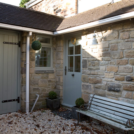
Last month's post covered our general rules for helping you find the finest paint colours for your Cotswold Stone home. This month, we're cutting to the chase, perfect for those of you who are still in a quandary, and sharing our top ten most popular front door paint colours for these beautiful stone houses.


Bathroom


6. BS Lizard. We can easily mix this into Dulux Weathershield for you to give an enduring exterior finish.


P1030167


The paint colours listed in this post, the most popular front door colours we stock, form a perfect blend of muted tones, inspired by nature, which call to mind the relaxed country feel of the Cotswolds. However, our Top Ten would certainly work just as well when combined with painted render, or, indeed, the smart mellow yellow of London brick-stock. Gentle greys, soft putties and cheerful blue-greens will all give you, your families and your visitors the warmest of welcomes!


Images via Modern Country Style, Farrow and Ball, Farrow and Ball, The Vintage Heart, The Cottage Gardener, Dulux, The Paper Mulberry, House To Home, Busy Bee Studios, Farrow and Ball

Enter your email address:

to subscribe to Relics of Witney

Wednesday, 1 May 2013

The Best Front Door Colours To Paint Cotswold Stone Houses

Relics of Witney is based in the heart of the Cotswolds, where, unsurprisingly, many of our customers live in homes built using beautiful Cotswold stone, like this make-believe house featured in The Holiday.

Try Little Greene's Lead Colour for a similar paint effect
Today, we want to help you think about the best paint colours to highlight the gorgeously complicated hues of Cotswold stone. Although our advice is always tailored to the specific needs of each customer, there are, broadly-speaking, three roads to go down; the first is to choose a paint colour that will harmonise with the stone, gently blending the door, windows and building to create a cohesive whole. We often recommend muted earthy colours to create this look, such as Earthborn's Cricket... 


  or Dulux Heritage Stone Green


Try Little Greene's Woodbine for the gentle cream pictured below. It's worth bearing in mind that you may need to pick out a much darker version of the colour you imagine to counteract the bleaching effect of the sun.


 Alternatively, draw the eye of passers-by with a contrasting shade that will still enhance the stone but stands on its own two feet colour-wise. Paint and Paper Library's Eucalyptus will give a similar effect to the next image.


A more contemporary take on this look is created by the use of dark colours that give a smart urban feel (think of Abigail Ahern with her door in Farrow and Ball Downpipe).


The third choice is to err towards the classic.


Sanderson's Fine Black is a perfect choice if you'd like to create a classic-looking frontage...


...or try Sanderson's Graphite for a softer effect.

Once you know which route you'd like to take, we always advise customers to take a good look at the front of their homes and ask themselves which colours predominate the stone. This question isn't as easy as it sounds. Without looking, they may say that it's 'grey' or 'yellow' but let's take a close look at this small sample of Cotswold stone:


Surprisingly, there are sections that are blue, dark brown, pink and muted orange, as well as the creamy-beige of the pointing. Identifying the specific tones in your stone, and then echoing those tones in your chosen paint colour will help to bring the whole building to life.
  
From the prevailing tones that you've identified, we can offer very specific advice, from our extensive knowledge of paint colour. For instance, if your stone tends towards the orange end of the spectrum then pick a red front door that also holds orange undertones. Try using Farrow and Ball's Radicchio.


Below is an example of how using the same red with Cotswold stone at the blue-ish end of the spectrum just doesn't grab your attention in the same way.


However, the blue door on the right (take a look at Farrow and Ball's Hague Blue) works beautifully as it picks up on the blue-ish tones of the Cotswold stone.

We hope this summarised look at some of the best front door colours to harmonise with Cotswold Stone has given you lots of inspiration. If you have related questions then do get in touch, either in person or via our website, to take advantage of our vast knowledge and and equally impressive enthusiasm!

Enter your email address:

to subscribe to Relics of Witney

Wednesday, 3 April 2013

How To Use Our Paper Pot Press

Now is the perfect time to be putting the finishing touches to your seed order, whilst trying to fend off this ghastly weather; cosying up inside our homes, catalogues in hand, and ideally nestled beside a roaring fire with a glass of wine.


One of the best ways to make your dream garden a reality is to make sure that when the garden bug hits you...and it will...you're absolutely ready for some sowing action.


We can help you by sourcing products that make the whole process as easy and straightforward as possible: a real pleasureFor many of you, we know that storage is an issue so when we spotted this oiled beech Paper Pot Press, which removes the pricking out and potting on stages, we knew you would love it as much as we do.


The Paper Pot Press avoids the need for endless plastic pots and trays, by letting you create your very own mini-pots out of newspaper which can be planted out directly. And because newspaper is biodegradable, the pots simply rot away in the moist earth - minimising any root disturbance and generally upping your plants' life expectancy.


Today, we're going to demonstrate, step-by-step, just how easy the Paper Pot Press is to use.


You will need:
One of our Paper Pot Presses
Newspaper (or similar biodegradable, thin paper)
Compost
Seeds


Cut out a strip of your chosen paper, roughly 40cm by 16cm.


Fold the strip in half along the length....


...and roll the paper around the Paper Pot Press, with the fold along the top of the cylinder.


Holding the rolled paper, scrunch the overhanging excess under the bottom of the press.


Align the top part with the base of the press. Push down firmly and twist to 'seal' the paper pot base.


Carefully slide off your brand new pot.


Fill with soil and your chosen seeds, gently water....


...and watch your flowers grow.

{You have our permission to feel very smug indeed.}


Enter your email address:

to subscribe to Relics of Witney

Friday, 1 March 2013

Farrow and Ball's New Wallpaper Collection

We can now place a minimum order of one single roll of Farrow and Ball's wallpaper, which ties in perfectly with letting us tell you all about Farrow and Ball's newly released wallpaper collection.
 
Tessella BP3604 from Farrow & Ball
Farrow and Ball's Tessella

It is aptly entitled 'Latest and Greatest', and features four new designs to add to their already beautiful range.

Lattice BP 3505 from Farrow & Ball's Latest & Greatest wallpaper designs.
Farrow and Ball's Lattice

This one-roll order allows you the freedom to play with the papers to your heart's content before you commit to repapering your entire hall.

Farrow & Ball's Rajah Stripe BP 3803 wallpaper
Farrow and Ball's Rajah Stripe

Texture is key in Farrow and Ball's designs. Because of their manufacturing techniques, these wallpaper are incredibly tactile, begging to be noticed.

Farrow & Ball's Rajah Stripe BP 3802 wallpaper
Farrow and Ball's Rajah Stripe

However, the extent to which they are noticed is up to you; each one of the four new designs is available in five different colourways, ranging from sumptuous neutrals to moody darks to the palest of pales with touches of glamorous metallics thrown in. This careful choice of Farrow and Ball shades provides a startling array of different looks as you can see from these images.

Lattice BP 3502 from Farrow & Ball's Latest & Greatest wallpaper designs.
Farrow and Ball's Lattice

In fact, with some designs you may have to look twice to see that it is, in fact, the same underlying pattern.

Horizontally hung Lattice BP 3504 from Farrow & Ball's Latest & Greatest wallpaper designs.
Farrow and Ball's Lattice

Farrow and Ball's wallpapers are manufactured using their own paint, which gives a uniquely elegant finish, as well as outstanding quality of colour.

Ocelot BP3703 from Farrow & Ball
Farrow and Ball's Ocelot

By building up layers of paint using hand-brushing techniques, these wallpapers create an unsurpassed background depth.

Ocelot BP3702 from Farrow & Ball
Farrow and Ball's Ocelot

They are finished with Farrow and Ball's protective glaze to provide extra strength to the FSC-approved paper, as well as stain resistance, which allows them to be wipeable.

Rajah Stripe BP3801 from Farrow & Ball's 'Latest & Greatest' collection.
Farrow and Ball's Rajah Stripe

Come in and take a leisurely browse through our range of wallpaper books, or email: sales@tryrelics.co.uk. With so much new choice, if you're looking for inspiration, or simply a helping hand, there's no better place to be than Relics of Witney.
 
Tessella BP3605 from Farrow & Ball
Farrow and Ball's Lattice

Have you had a go at any of our ten ways to use wallpaper that featured in our window here?


All images via Farrow and Ball

Enter your email address:

to subscribe to Relics of Witney

Friday, 1 February 2013

How To Create A Scandi-Chic Floor With Osmo's Oils

In Part 2 of our mini-series featuring Osmo products, we'll be showing you how to create the Scandinavian floors that we shared in our last post.


There are so many products available that it can be daunting to know where to begin but by shopping at Relics of Witney, rather than a huge DIY chain, you can rest assured that we've whittled down the range for you; we only stock products that we love, that we have experience with and about which we can offer expert advice.


Take Osmo, for example. The downstairs of Kate's beautiful cottage used to be a mix of carpet and lino but has been utterly transformed by their outstanding range of naturally-based oils.


First, pine boards were laid (which can be supplied through Relics). Then, after experimenting with spare bits of flooring to see how the colour of the pine would change with varying amounts of tinted oils, Kate decided to enhance the natural paleness of the untreated pine with one coat of Osmo Polyx Oil in White Tint.


Osmo's Oils can be rolled on (with purpose-made rollers for the job) but here they were applied with Osmo's natural bristle brushes, which give an extremely smooth finish.


The White Oil Tint was followed by one coat of Osmo Polyx Oil in Clear Satin, which was, again, applied with a brush.


Kate chose the Satin-Matt Oil, rather than Matt, to give the floor a finished feel, plus the slight sheen maximises the light and airy feel that Kate was after.


Before committing to such a big project, we'd recommend experimenting with Osmo's oils on off-cuts to make sure that you end up with exactly the look you're after. At Relics, we have small-sized pots for this purpose, as well as treated wood samples to help you pick out the right combination of Osmo's products for your floor.


Enter your email address:

to subscribe to Relics of Witney

LinkWithin